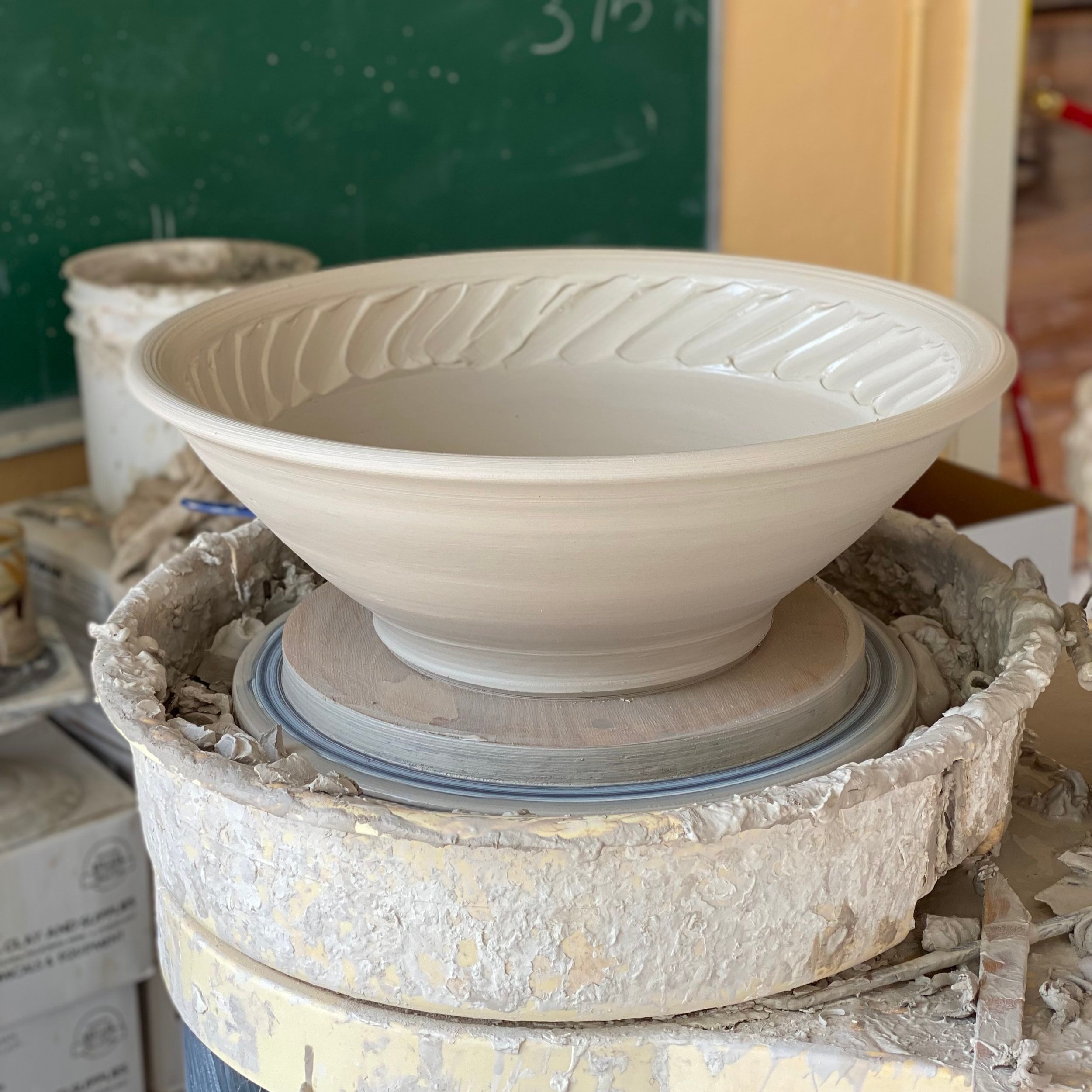
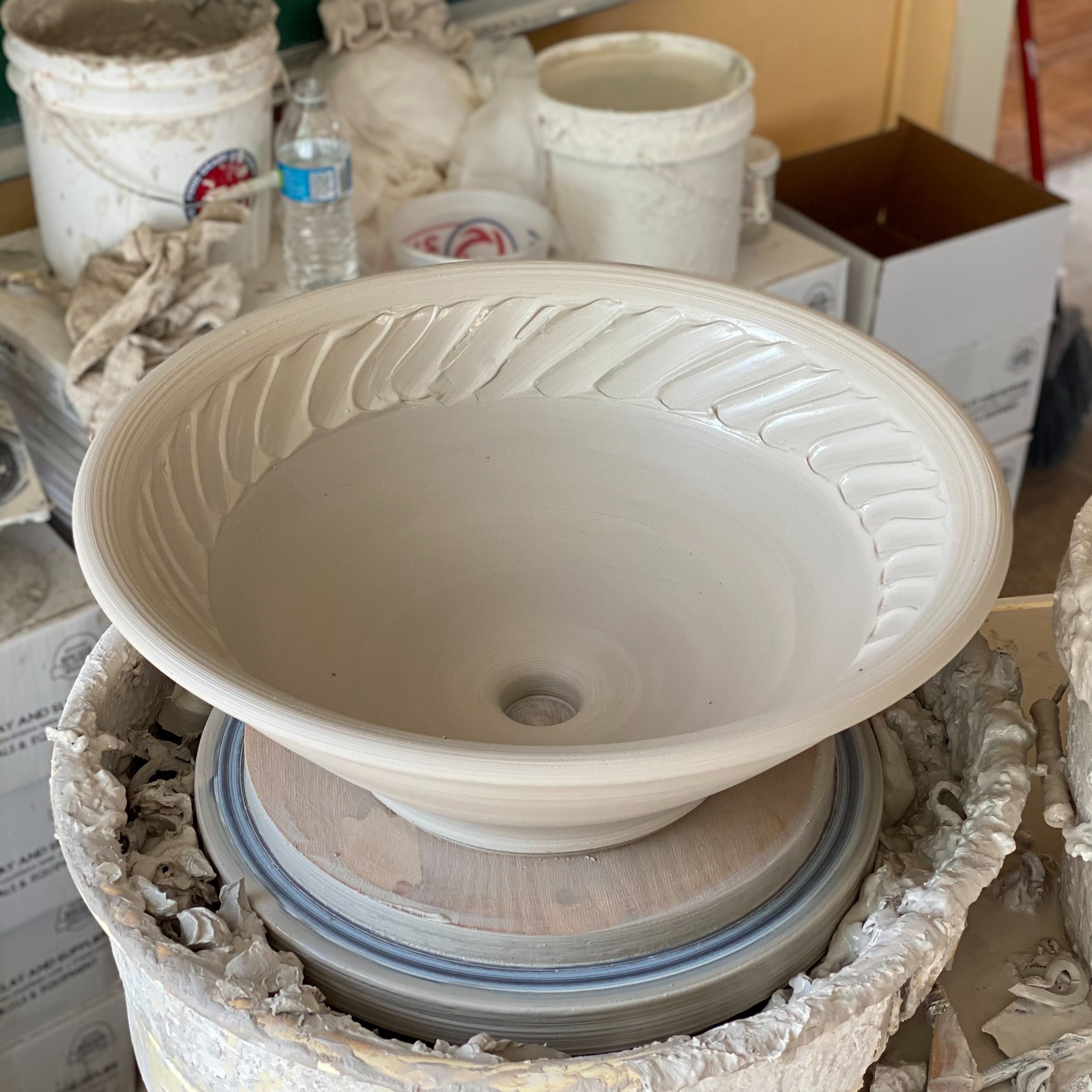
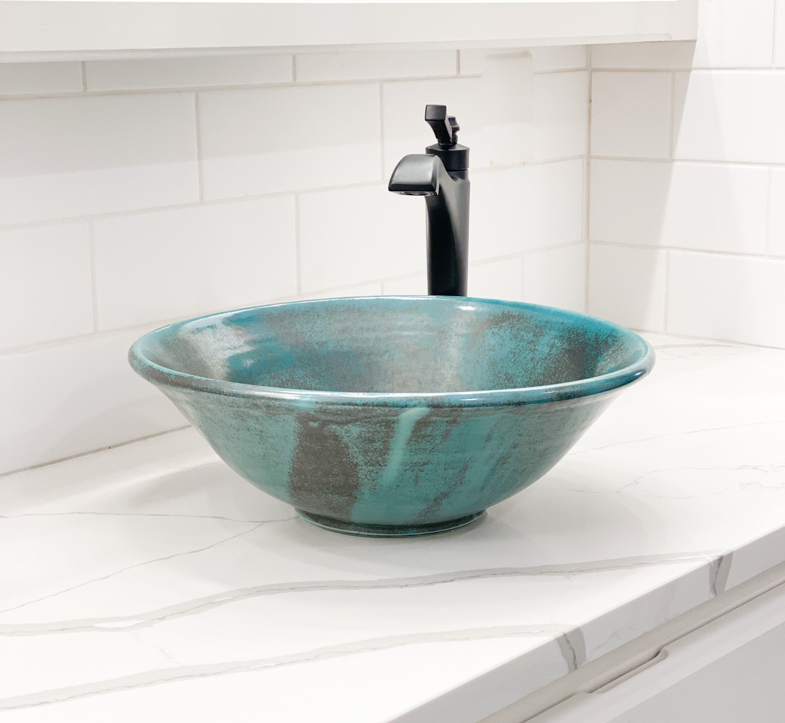
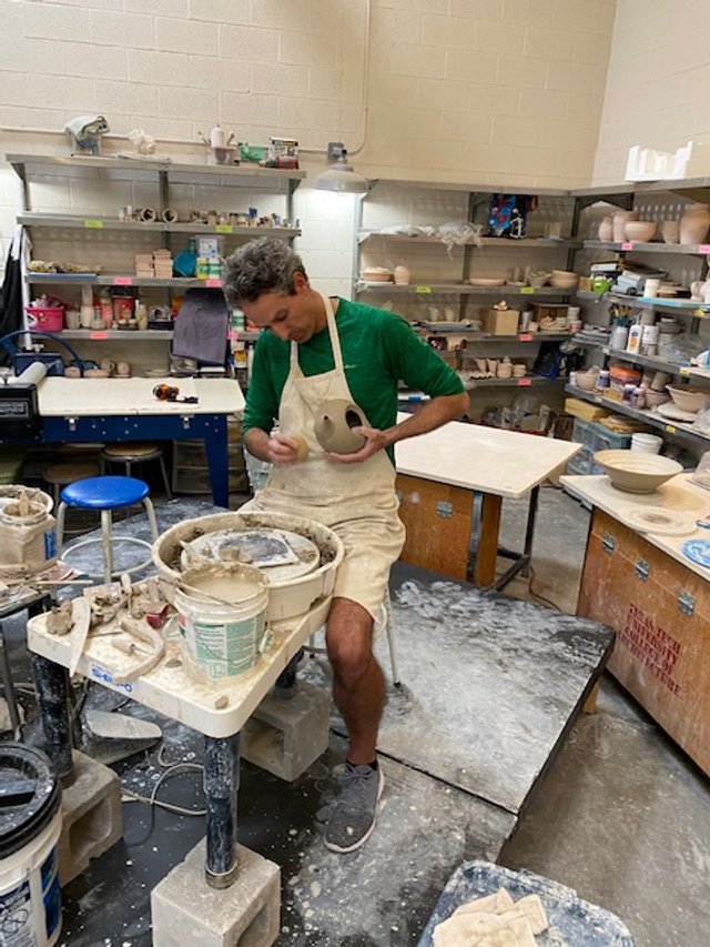
Megan Harris

DESIGNER SINKS

Designing is really about creating a quality of life, and a beauty in that life that nourishes the soul, that makes life beautiful.
— Albert Hadley

When Kent and I bought our home six years ago, we were looking for a house that did not need to be remodeled. Having previously owned an older cottage in the Wolflin neighborhood, we’d had our fill of renovations! But like most people, we soon forgot past renovation woes and dreamed of adding our style to the new home. As artists, we are always interested in creating something beautiful. We can’t resist reimagining our spaces, and that leads us to more remodeling!

This past year we focused on updating the Master Bathroom and Guest Bathroom. New countertops create the perfect backdrop for sinks Kent made on the potter’s wheel. For the Master Bath, Kent formed two sinks that were identical in shape and similar in color. After bisque firing the two sinks, he used a handmade turquoise glaze that evokes calm and tranquility. The natural streaks of black complement the new matte black fixtures. The bathroom's color palette is neutral, so the sinks become the focal point.

Kent has made some beautiful sinks in the past, but these are my favorites! This remodel has prompted him to make more like these to sell in our gallery. Handcrafted sinks are perfect for homeowners looking for something unique for their bathrooms. I’ve noticed a lot of people are combining custom ceramic sinks with artistic spouts for a designer look. If you want a one-of-a-kind clay sink, please get in touch with us or stop by the gallery during regular business hours. Sinks can be made with either porcelain or stoneware clay, and we have a variety of glaze colors to choose from. We would love to help you.

Our custom sinks are formed from soft clay on the potter’s wheel.

Kent forms a hole for the drain so installation is simple.

Design with Beauty in Mind.


REUNION TOUR

You lay your head on the pillow.  You look up at the ceiling, and the room is spinning.  You feel like you’re on a carnival ride when you shut your eyes.  No, you didn’t drink too much.  You just sat at the potter’s wheel too long!  

A few weeks ago, Kent and I had the opportunity to teach a workshop at Mudslingers 2021, and we sat at the potter’s wheel for so many hours the room was spinning.  We and two friends, Von Venhuizen, Associate Professor of Ceramics at TTU, and David Echols, Ceramics Art Educator at Frenship High School, were invited by Roger Holmes at the Helen DeVitt Jones Clay Studio to participate in the event. The Clay Studio is part of the Louise Hopkins Underwood Center for the Arts in Lubbock, Texas.  It is a working studio dedicated to inspiring and enriching the community through the ceramic arts, and it has a group of dedicated members who attended our workshop!  

Roger dubbed this year’s event the “Reunion Tour” since Von, David, Kent, and I have been friends for many years.  The event is an annual tradition, and this is the second year we have been invited.  At the 2018 Mudslingers Event, we had an exhibition of our work in the Texas Tech School of Art Satellite Gallery, but this time, we displayed our pots in the Clay Studio.  It worked out great because people could look at our finished artwork while we were demonstrating.  

After setting up our display on Thursday afternoon, we headed to the Firehouse Theatre, where each artist presented a slideshow and gave an Artist’s Talk.  Kent and I made pots all day on Friday, so we would have them ready to trim, flute, and add handles on Saturday.  If you aren’t from the Texas Panhandle or some other dry climate, that sounds crazy.  When I lived in Virginia, I waited weeks for pots to dry.  Around these parts, we usually wrap our pots lightly, and they are ready to finish the next day!  To our surprise, it rained a lot on Friday, slowing the drying process!  Fortunately, we could dry our pots outside Saturday morning and finish them in the afternoon.

Kent and I made bowls, mugs, cups, and vases for the workshop. Kent also made several tall pitchers, a teapot, and a pilgrim bottle.  I made a family of three fluted pitchers with attached slab spouts and demonstrated fluting techniques and tools.  Kent also showed how to use porcelain slip to make waves and natural patterns.  We both love making lots of pots, but the best things about a workshop are meeting new people, catching up with friends, and sharing ideas with fellow creatives.  Of course, we also love to go out to eat, and we enjoyed visiting our favorite Lubbock restaurants like Capital Pizza and Flippers Tavern!

Kent and I continue to be amazed by all the support we have from our Lubbock friends.  Thanks to everyone who came out to the event.  We thank Studio Assistant Andrew Carrizales and Director Roger Holmes for an incredible weekend!

Bowls and cups by Megan Harris.

‘Demo pots’ by Kent Harris.

Drying mugs by Megan Harris.

Kent finishing a teapot.

A few of Kent’s finished pots.

Tools of the trade.

Live your best life. Take a clay class!


MURAL COLLABORATION

Photo courtesy of Nate Pfeil

Photo courtesy of Nate Pfeil.

Drive down Rt 66 in Amarillo, a.k.a. “6th” by us locals, and you will now see a boldly colorful rendering of Palo Duro Canyon on the side of Blue Sage Pottery. Get out of your car and take a picture with our pottery shop dog superstar, Ranger, who is enjoying a hike up the Comanche Trail. Let him lead you into the twisting trees and teetering hoodoos as you pose for your latest Instagram post!

This 15 ft. tall, 70 ft. long mural was a collaboration between me and the amazing student team, Blank Spaces Murals, led by Shawn Kennedy and Shanda O’Neill. You’ve probably seen a number of their murals around town!

After spending a large chunk of the summer working on a contour drawing and a preparatory painting, I finally decided the collaboration was ready to begin. Figuring out how to weave together multiple inspirational photos and plan a large-scale mural by working in my usual expressive style had been mind-bending. I was relieved to finish that phase and begin working with the team!

The collab began with selecting paint colors to match my original piece. That was both fun and challenging! When painting, I mix most of my colors instinctively as hues pop into my mind. Selecting paints from a color wand was an altogether different process! It took three of us comparing colors and discussing possibilities to get the colors chosen! After the paints were selected, the team painted the walls with a vibrant red. This is exactly how I begin my landscape paintings. Next, we projected a line drawing onto the red wall and traced the lines with a darker red. From then on the mural progressed quickly. Afternoons were spent layering colors, conversing, adapting techniques, and watching the team translate my vision into reality. The pictures below say it all! Click through to see the whole process!

My original acrylic painting that the mural is based on.

My original acrylic painting that the mural is based on.

 
Photo courtesy of Nate Pfeil

Photo courtesy of Nate Pfeil.

Stop by and snap your picture with Ranger.


SIDE BY SIDE

Back in January, the wild winter storms led to impromptu painting sessions with my niece Maddy Watkins. With school canceled and Maddy stranded in Amarillo, we used the unexpected time to paint together. Although she is only 19, she has already developed her talent for art through classes and practice. She is an avid photographer and loves to paint. Being a nature-lover like myself, she is interested in landscape painting. In this blog, I wanted to share how we painted side-by-side during the storms!

Over the past 20 years, I have taught many children, teens, and adults how to paint, but I usually teach large group classes that demand structured approaches and planned projects.  This was different, so I decided to take Maddy to my studio and wing it! First, I asked Maddy to rummage through my box of original travel photos and find an interesting image.  She picked a mountain scene near Silverton, Co where we both love to visit!   

Next, Maddy and I loosely sketched out our compositions on paper.  We then discussed our sketches and decided to use bits and pieces from each of ours.  We prepared our canvas panels with red acrylic paint mixed with GAC, a translucent, gloss medium to begin the painting.  Once the red ground dried, we painted outlines with an orangey-red hue, mapping out the shapes and creating visual pathways.  It all became collaborative as we mixed colors, chatted, and shared ideas!  What started as a painting lesson for my niece evolved into a painting session with a kindred spirit.  

I initially thought we would paint Alla Prima (or all at once), but after eight hours of painting over two days, neither of us was finished!  Maddy had to return to Houston before our paintings were complete, so she took hers home for final touches.  It took me several more sessions to achieve the look I wanted, but I love the final piece so much that I am bringing this one home!  Check out my finished painting below!

After sketching out our compositions on paper, Maddy (on the left) and I (on the right)  began to sketch directly on to the canvas panels!

After sketching out our compositions on paper, Maddy (on the left) and I (on the right) began to sketch directly onto the canvas panels!

 
This photograph shows our first layers of paint.  We tackled the foreground first and worked our way up the canvas.

This photograph shows our first layers of paint. We tackled the foreground first and worked our way up the canvas.

 
After the second layer of paint, things got messy!  We both started painting intuitively, focusing on different areas.

After the second layer of paint, things got messy! We both started painting intuitively, focusing on different areas.

After several more solo painting sessions, I finished the painting featured above.

After several more solo painting sessions, I finished the painting featured above.

Liven up your walls with original paintings.


HANDMADE MUGS

My day begins and ends with handmade mugs. Coffee in the a.m. and tea in the p.m.  All the ‘dishes’ in our home are handmade, so I have many unique mugs to choose from. Although I have a lot of options, I gravitate towards a few.  I think of these as my ceramic soulmates.  They are the mugs I dig around in the cupboard for or open the dishwasher mid-cycle to find.  How about you?  Do you have a favorite handmade mug, or maybe a few? 

Fluted mug by Megan Harris

Fluted mug by Megan Harris.

Since the year began, Kent and I have made about 350 mugs between the two of us, and all of those are unique in some way.  Forms, colors, textures, patterns, and marks vary! All the variations make it easy to find a mug that seems ‘made for you’. Read on for tips on selecting a handmade mug for yourself!

HOW TO SELECT A MUG

Finding your ceramic soulmate is a lot like finding your actual soulmate.  Below are a few tips to get you started when selecting a mug:

1 Don’t seek perfection. 

Sometimes, it is the unexpected element that makes us love a mug.  Maybe it is the softly altered rim or the undulating marks of a tool. Perhaps it is the way that a paddle indentation fits your hand.  Don’t try to find a ‘perfect’ mug. Perfect is boring.

Seek Unique.jpg

2 Take it slow

If you can visit the gallery, check out the mug racks.  Pick up a mug and envision filling it with your favorite hot beverage. Find a mug that feels right in your hands. If you are shopping online, spend a few minutes looking at all the photos. 

mug rack (3).jpg

3 Trust yourself! 

Be open to possibilities.  You may want a specific form, color, or style, but another mug attracts you. Trust your instincts and bring a little artistry to your daily routine!

FIND A NEW FAVORITE.


PAINTING COMMISSION

A painting is merely a daydream until you begin to make marks on the canvas.  Last summer, I dreamed up a painting for a couple that had commissioned a large artwork for their bedroom.  The clients are avid art collectors who love color and expressionism.  It was an exciting prospect to create custom artwork for these family friends who love bold colors as much as I do!

The clients for this commission asked for a painting similar to pastel drawings of mine they bought years ago.  The drawings are small Alla Prima artworks composed of vibrant colors and staccato marks on a dark ground. 

Those drawings are a foreshadowing of my current painting process, though I now use the Alla Prima approach mostly in studies for more lengthy paintings.  I am free in my use of color and line when painting a scene “all at once.”  The challenge lies in taking that spontaneous approach and sustaining the energy of the mark-making in a longer painting. 

I love receiving commissions because I am forced out of my comfort zone.  I become a tightrope walker, balancing the clients' vision and the painting I dream up.  Stepping out on the wire will allow a mere dream to become a physical reality.  It’s easy to stand on safe ground, painting in my mind’s eye, but I finally walk out on the wire to gather reference photos, sketch ideas, and paint color studies.  

After painting a small study, I began the larger canvases with a bold red under-painting and dark shapes for the trees in the foreground!

After painting a small study, I began the larger canvases with a bold red under-painting and dark shapes for the trees in the foreground!

This photograph show the first layers of paint.

This photograph shows the first layers of paint.

The Study

To begin this commission, I did several gestural pencil sketches from original photographs of rural New Mexico.  The primary photographic reference is a scene with tall, thin trees in the foreground, wild sagebrush in the middle ground, and mountain ridges in the background.  Beginning with a photograph helps me envision the final painting, but I never feel bound to the captured scene.   When I started getting serious about art, my mother reminded me that artists “move things around”. Mama knows best!  The more experience I gained in drawing and painting, the more comfortable I became with the “moving around” process.  Now, I mostly use photo references as a jumping-off point.  

After sketching, I painted a textured watercolor paper with a thin wash of red paint.  A mixture of Cadmium Red and Quinacridone Magenta creates a vibrant background that is somewhat neutral in color temperature.  Starting with a red underpainting is also a little nod to the Fauves.  I let the base coat dry before drawing the scene with oil pastel.  (That is the Alla Prima part.)  Satisfied with the color scheme emerging with the oil pastel, I began to think about the space where the art would be installed.  I then stretched and primed three small 8” x 15” canvases on some old frames I had in the studio.  Next, I began a multi-layered three ‘panel’ study with acrylic paints.  I thought three canvases depicting one large scene would give the viewer the impression of looking out a window into a fantastical, colorful world.  It is also another little nod to works from the past, this time to European paintings from the Middle Ages when triptychs were so popular.  

Again, I painted a reddish layer to begin.  I knew this painting would need to be more ‘cool than warm’ to visually ‘pop’ off the richly glazed orangey wall where it would be hung.  Beginning with a red underpainting was excellent because it allowed me to paint complementary greens and blues for the following layers. I like to do a small study with the exact dimensions as the final piece because it allows me to work out the composition using shapes and spatial relationships, elements essential for landscape paintings.  In a large landscape painting, I try to create visual pathways that will lead the viewer’s eye into the painting and move it around the scene.  I also consider how to create an illusion of space using basic perspective techniques such as overlapping, scale, and value changes since I often defy the conventions of overt realism.  

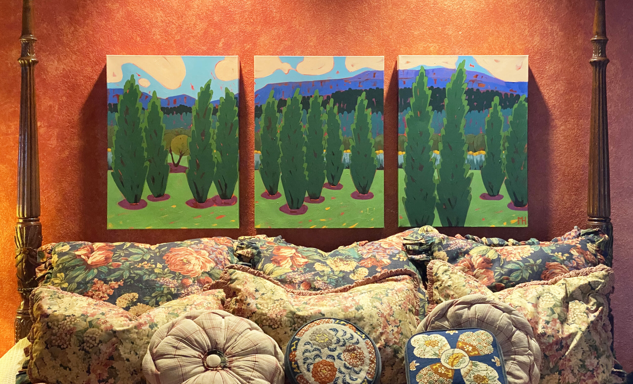
Using three canvases to create one scene appealed to the clients, so I ordered new gallery-wrapped canvases that sit 2.5” off the wall.  The modular approach allows the canvases to be moved and hung more easily than one large, heavy canvas.  It also allows me to fully embrace the three-dimensionality of the deep canvases by painting the scene around the edges.  One of the benefits of this is that it looks best without a frame and further simplifies installation.  

From Study To Painting

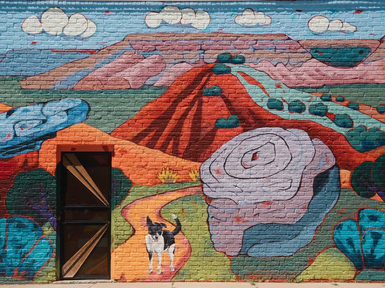
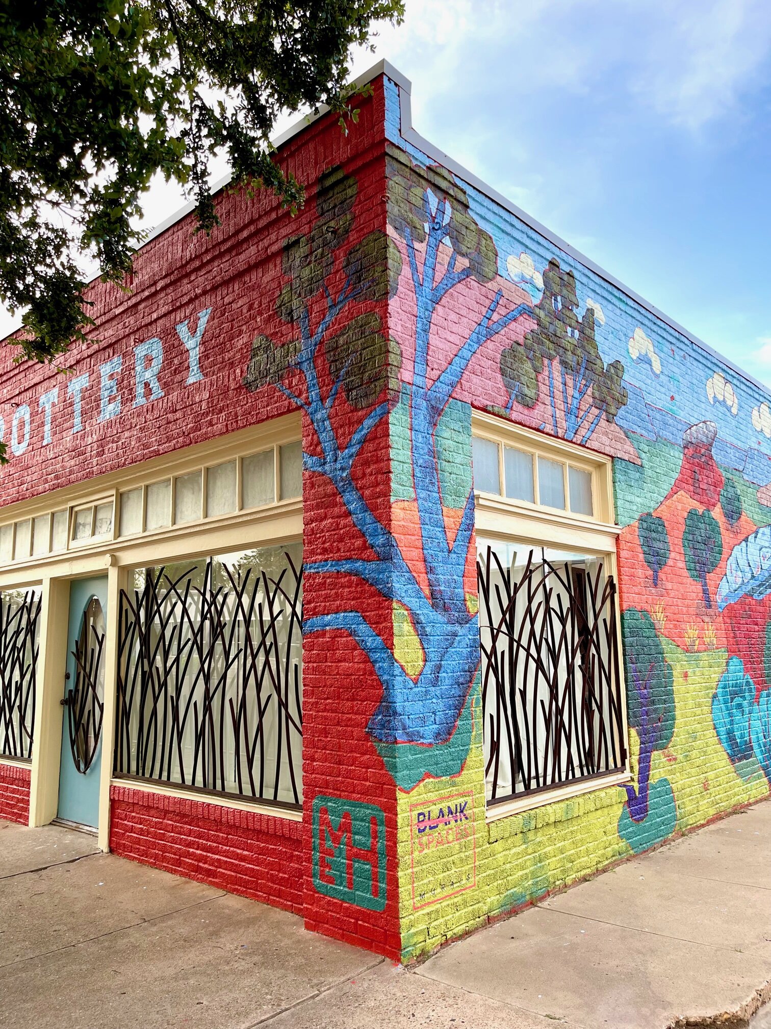
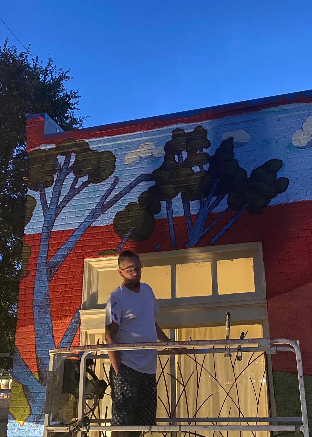
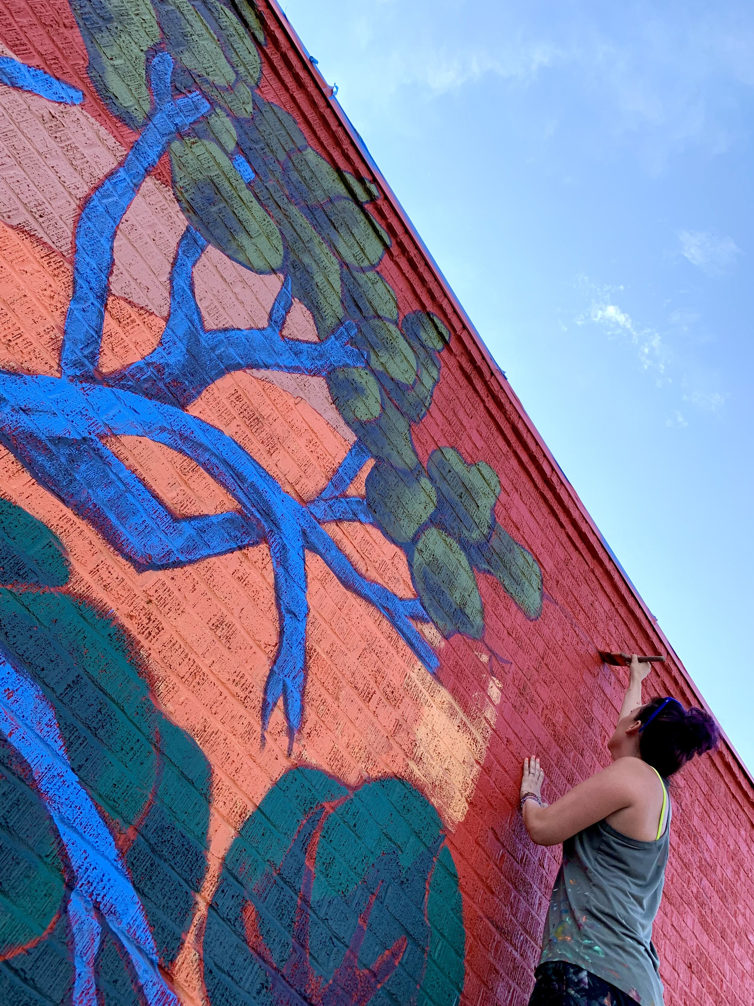
Every mark you make in a painting informs the next, so naturally, every painting is different.  Even when I paint a study, the larger artwork will be unique.  One of the things I intentionally changed from the study is the light source.  When painting the study, I imagined the sun setting but later felt everything remained too dark.  For the final piece, I imagined the sun higher in the sky, backlighting the trees with a warm olive-green line and infusing the clouds with a pinky-orange glow.  Lightening the contour of the trees allowed them to stand firmly in the foreground and created a more convincing scene.  

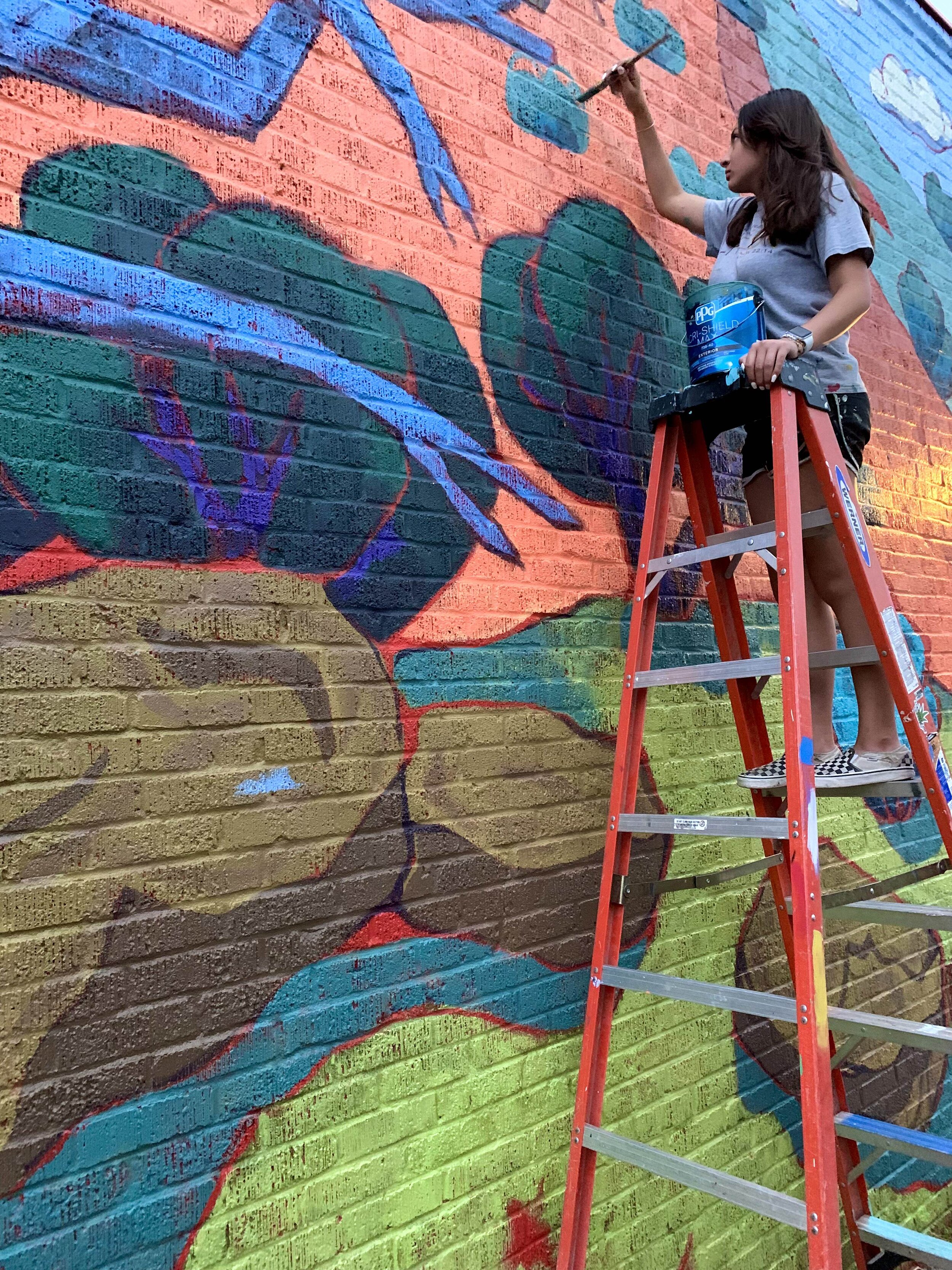
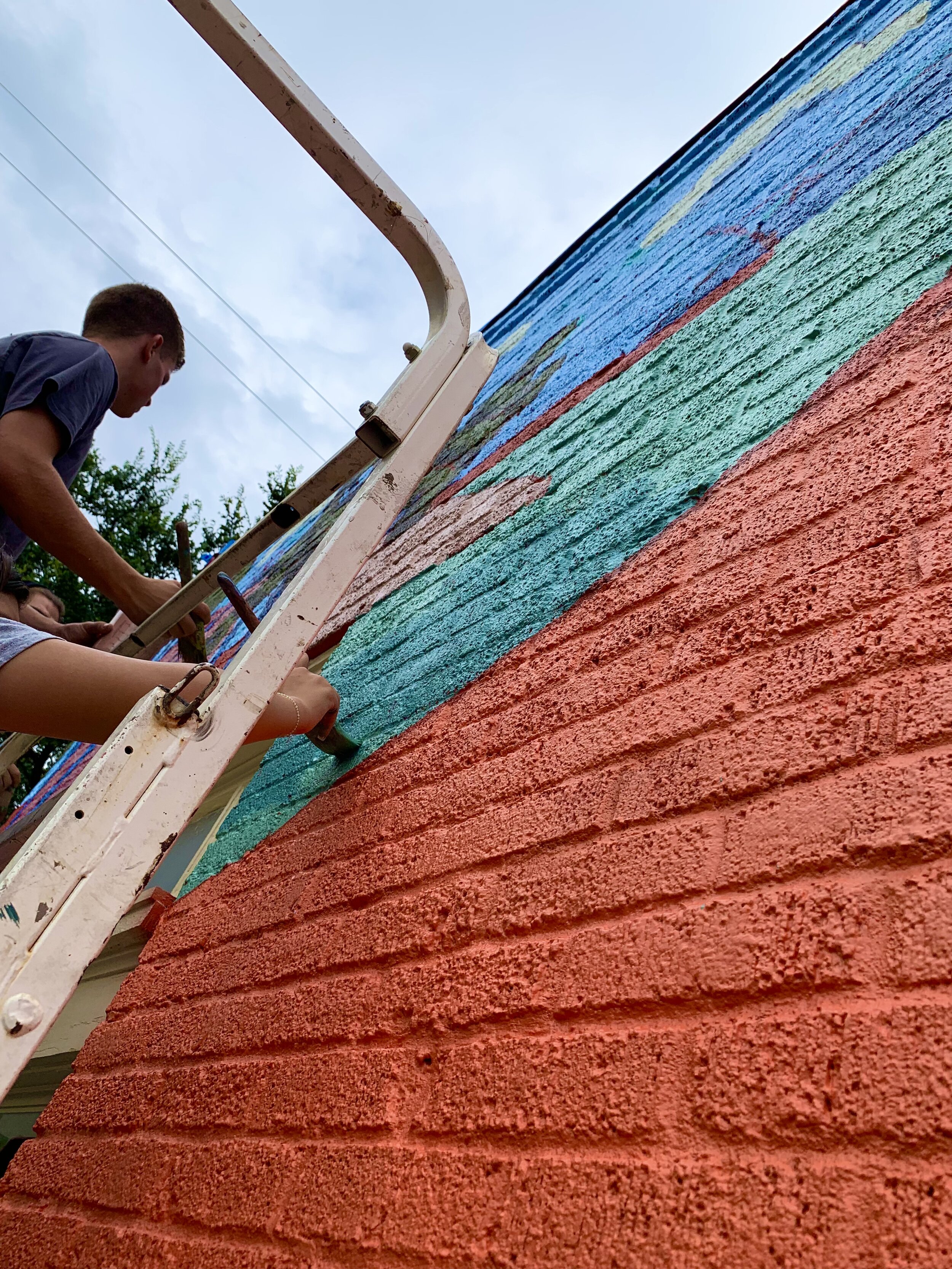
The trees have at least five layers of paint.  I started with an undiluted Pthalo Blue to paint the shapes, as seen in the first photograph.  I then layered green paints to make the trees feel substantial.  While trying to increase the density of the trees, I lost much of the underpainting.  I decided to add strokes of Mars Black and Alizarin Crimson over the green and then add another layer of green to unify it all.  I love how the trees turned out, and I plan to rework a few trees in older paintings with a similar approach.

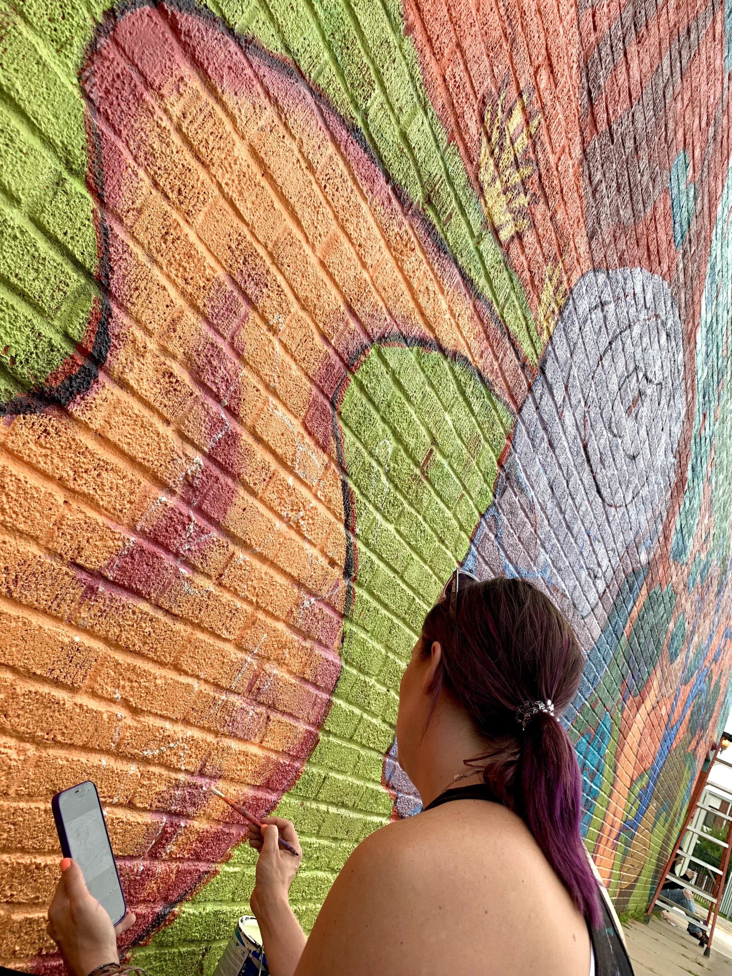
In this painting, I wanted the warm oranges and pinks in the foreground to suggest the earth under the grass and, simultaneously, be similar to the room's color.  I try to use the same hue in at least three different areas of a painting.  I have found it not only moves the viewer’s eye around the work but also aids in creating unity and balance.  I often don’t repeat the same exact color throughout a piece, but I will use the first color and mix it into another. In this painting, I carry the orange of the earth into the clouds and sagebrush.

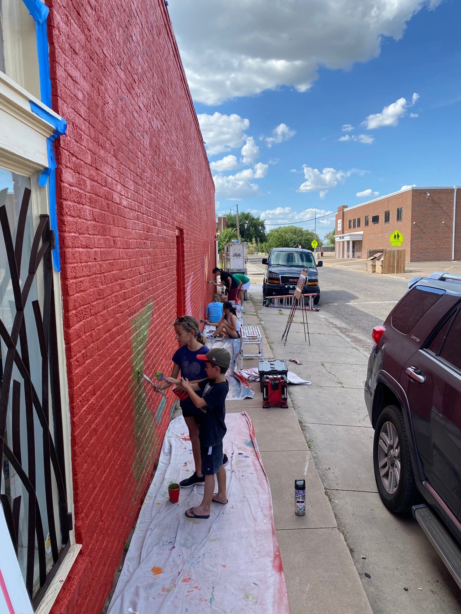
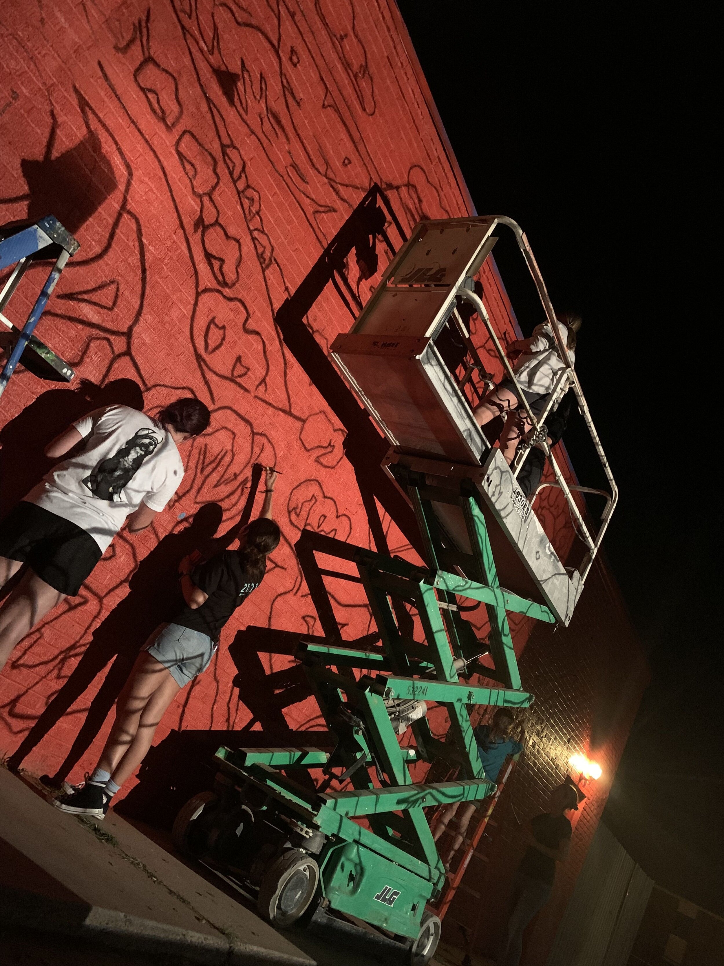
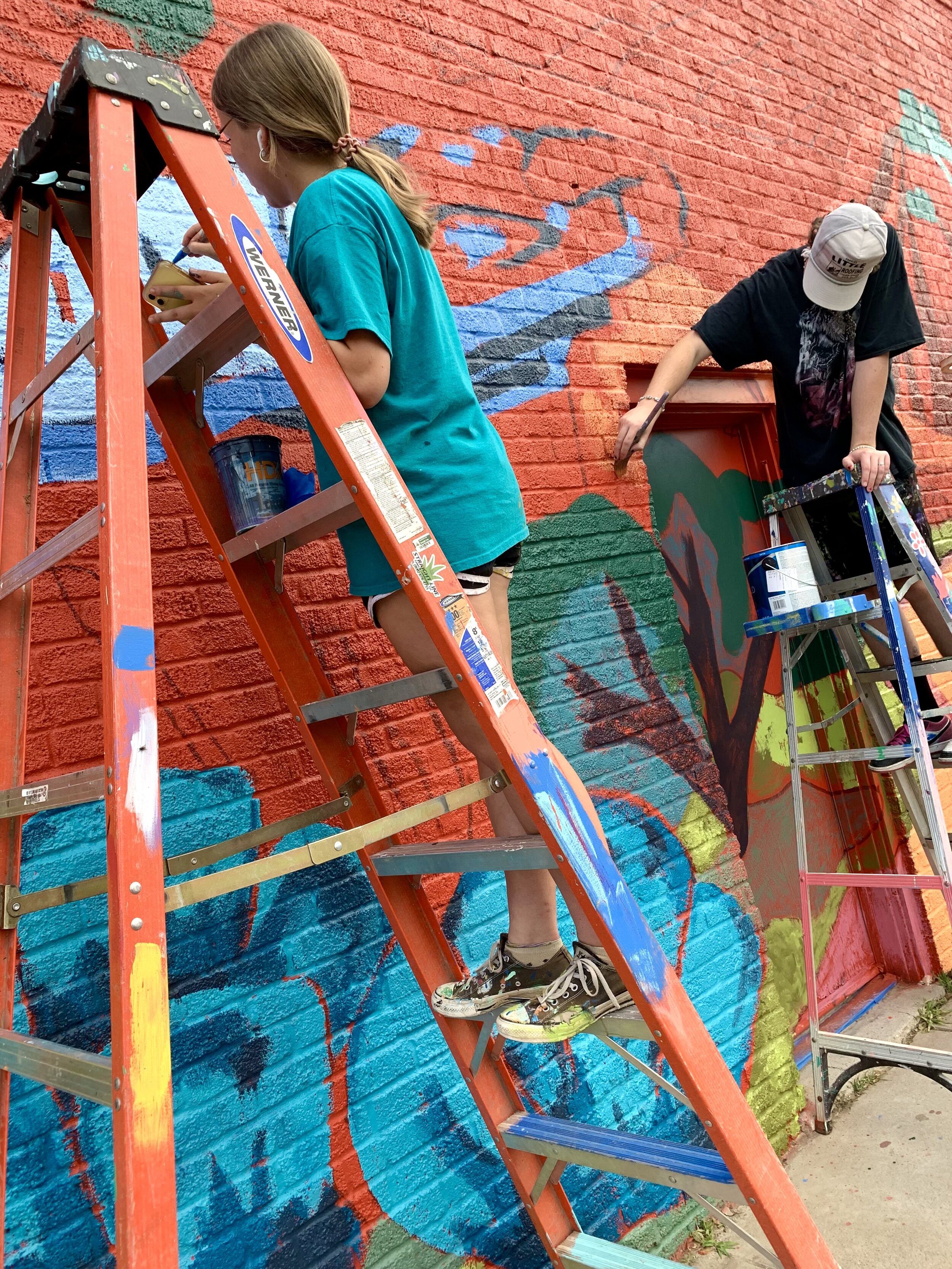
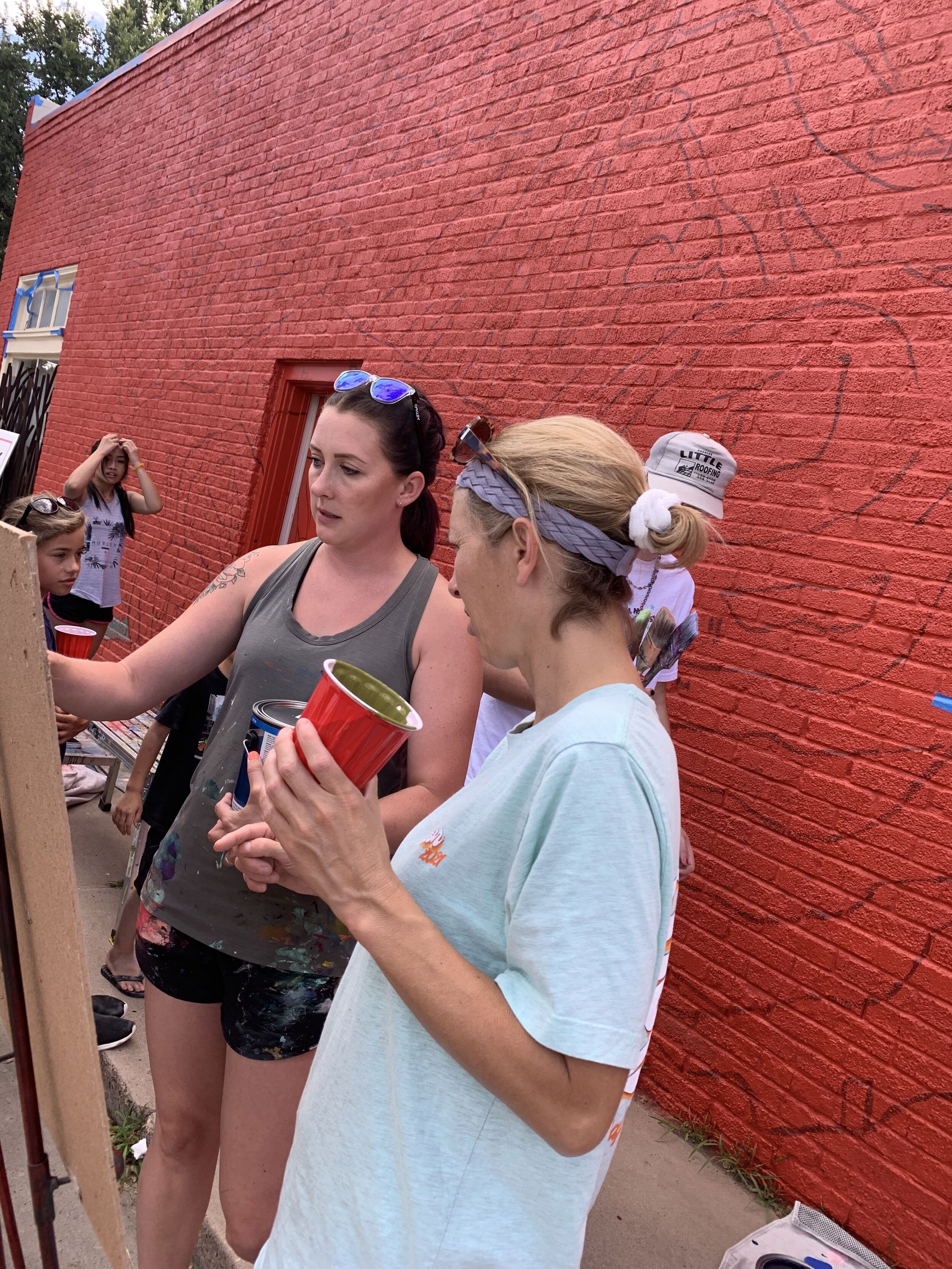
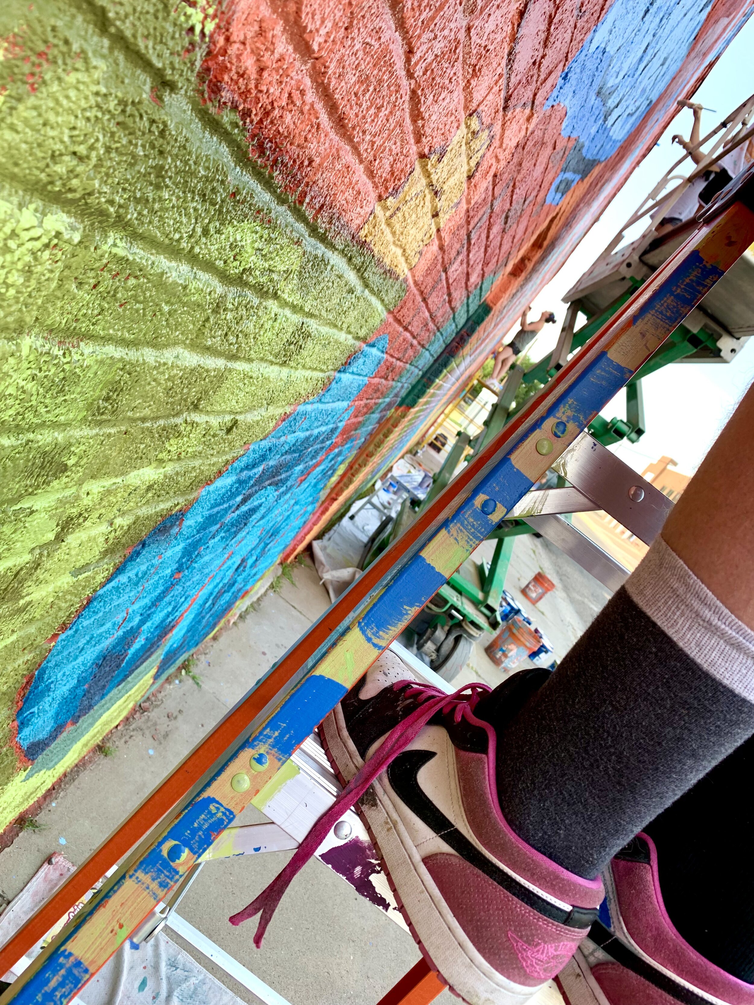
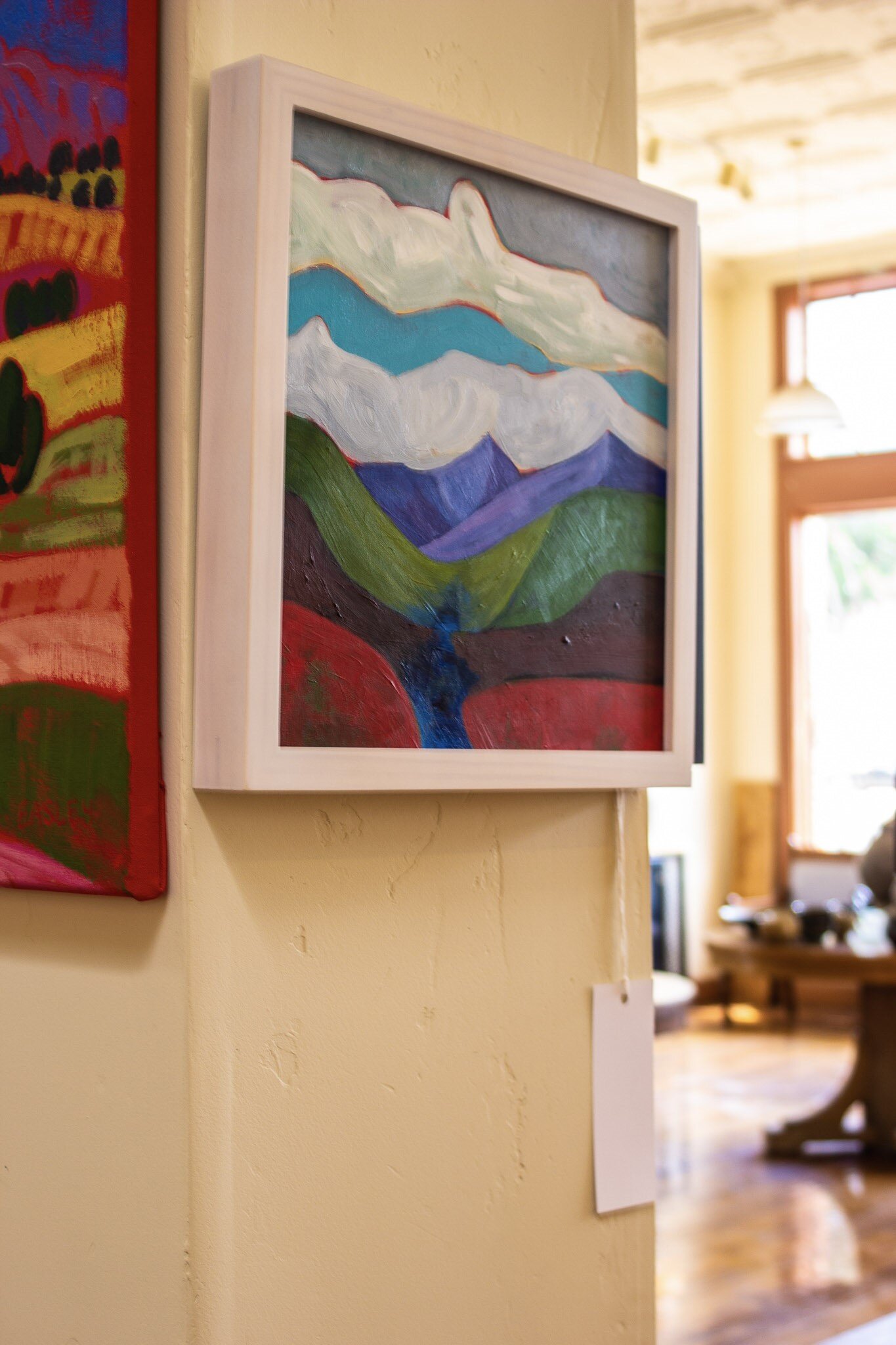
After about thirty hours of painting the three final canvases, the artwork felt finished.  It’s important for me to make sure that the spaces read correctly, but at the same time, I want to leave expressive marks and reveal contrasting colors.  Trying to make it too “perfect” can lead to a very boring artwork, and I believe that should be avoided!  It’s time to show it to the clients when it is completely finished.   The clients for this painting loved it, and I am so happy!!  They immediately installed it at home and sent me the photo below. 

FinishedPainting.jpg

BRIGHTEN YOUR WALLS.


TILE PROJECT: PART III

Last summer, I promised to share photos of the completed tile project for our friends! If you didn’t get to read the first blog, TILE PROJECT FOR FRIENDS, I explained how Kent made over 300 tiles by hand for their newly built home. In the following blog, TILE PROJECT: PART II, I shared how the project was progressing. The tiles were installed in the fall, and Kent recently had a chance to stop by and snap some photos! We are so pleased to have Kent’s stoneware tiles enhancing our friend’s home. Now, we need to find some time to make tiles for our kitchen! More to come about that…

IMG_0959.jpg
 
IMG_0962.jpg
IMG_0965.jpg

LET YOUR HOME INSPIRE.


OIL BOTTLES

Sometimes, creating and teaching ceramics can be tiring.  Don’t get me wrong, I’m not complaining! Being creative all day and connecting with others is incredible, but all the decision-making can leave one mentally drained. Not to mention that wedging clay, making pots, and loading kilns is physically demanding. Another creative task, cooking dinner, sometimes feels monumental after a tiring day in the studio. I often need a spark to get in the mood for cooking after long, busy studio days. My go-to spark is the smell of fresh garlic sauteed in olive oil. That aromatic goodness revives me enough to start cooking.  Half the time I don’t know what I am going to cook, but if I can get motivated enough to chop some garlic and sizzle it in olive oil good things will happen from there.

Freshly thrown oil bottles drying on ware boards.

Freshly thrown oil bottles drying on ware boards.

My favorite part of beginning to cook is when I take our stoneware oil bottle and drizzle golden oil into the warm cast iron skillet. The bottle is one that Kent made, and the glaze is matte yellow with iron speckles. Kent has been making many oil bottles like ours lately, so I thought I would write a short blog highlighting the top reasons why I think the bottles make great gifts.

TOP FIVE REASONS

BLUE SAGE OIL BOTTLES MAKE GREAT GIFTS:

  1. It prevents oil from rancid by blocking light, oxygen, and heat.

  2. Metal tops let the oil drizzle slowly, making you feel like a chef!

  3. Ceramic pottery is safer for food storage than plastic because plastic can contain chemicals that leach into food.

  4. Potter’s thumbprint on the pot's side makes it easy to grab when cooking and reminds you that a human being made it!

  5. You can have beautiful, functional art on the kitchen countertop.

Fired oil bottles in the kiln about to be unloaded.

Fired oil bottles in the kiln about to be unloaded.

Glazed and fired oil bottles on display in the gallery at Blue Sage Pottery

Glazed and fired oil bottles are on display in the gallery at Blue Sage Pottery.

My favorite thing about our wheel-thrown oil bottles is that you can have original art on your countertop. The bottles are made with stoneware clay and finished with glazes we create from scratch. Each is thrown on the potter’s wheel and dipped individually in the glazes. That results in each bottle being totally unique! Kent and I believe that you should surround yourself with things you know to be beautiful, and that is one reason we are motivated to make and sell functional art for the home. If you are looking for a special gift for someone who appreciates artisan items and likes to cook, the oil bottle makes a great present. You could also purchase two, one for oil and one for vinegar, if you want to give a matching set. We have several oil bottles in our gallery, but you can purchase them online on our Kitchenware Page. Feel free to message us about the availability of other glaze colors. We would love to help you find the perfect gift!

Get Cooking with a Handmade Oil Bottle


ESPRESSO REDESIGN

Any Master of Fine Arts student knows that a vital part of an art class, albeit dreaded, is the ‘crit.’ Partly a rite of passage in which we sometimes endured the ‘ugly stick,’ the classroom critique served to prepare us to analyze and evaluate our artwork upon graduation.

As art students, we haphazardly learned the Principles of Design which led us to investigate various frameworks for artistic reflection and allowed us to construct our foundation for self-critique eventually. We asked ourselves the following questions when designing something as seemingly simple as a mug. Does the piece have the right visual weight? Is it visually balanced? Does the handle leave a pleasing ‘negative space’ silhouette? Does the handle flow out of one line and into another? Are the beginnings and endings of the pots intentional? Are changes in planes emphasized? Most importantly and more elusive, does the pot reflect my artistic influences and personal philosophies? That seems like a tall enough order for a mug, but more questions must be asked. As potters, we must go beyond design basics and personal choices to ponder functional considerations.

How will this mug feel in someone’s hands? Is the texture too sharp? Is the physical weight right? Is the handle close enough to keep from putting a strain on the wrist when filled with liquid? Will the mug tip over when filled up? Is the rim too flared so that coffee will easily splash out? Is the handle attachment secure? Is the handle placed in a way that enhances the form while still comfortable? Will the rim feel natural when one puts their lips on it? Will the liquid flow over the rim when drinking? Should it have a foot-ring? Is the base too wide or too narrow, or just right?

Even though it has been many years since Kent and I were MFA students, we embrace lifelong learning and continue this evaluation process. Sometimes, we make rapid artistic decisions intuitively, while others take more deliberation and time. Kent and I spent several years in school studying historical forms, solving visual design problems, sketching pots, and making thousands of pieces we used and analyzed. I don’t mean to overstate the work involved. It was challenging, but we also experienced much joy from this process and still do! Like then, Kent and I often act as sounding boards for each other. Our dining room is a veritable “Test Kitchen” for form and function. And we listen to our customers.

Recently, a few customers mentioned that espresso mugs should be smaller than the mugs we had made. Most of our espresso mugs at home have become water cups for kiddos because they are difficult to knock over, have a lower center of gravity, and have a smaller handle perfect for little fingers. We don’t drink that much espresso except for Kent’s occasional Caffe Americano. Hearing from customers that the espresso mugs needed to be a little smaller was an excellent opportunity for a ‘redesign.’ Kent has spent several weeks making more petite espresso mugs, and we wanted to share some photos. If you like what you see, check them out on the mug rack at Blue Sage Pottery.

Satisfy your coffee craving WITH our new MUG


CREATIVE EYE

Ansel Adams once said, “You don’t take a photograph, you make it.” A few weeks ago, we had the pleasure of Scotney Blackburn ‘making’ photographs in our gallery. Scotney is the creative eye behind Garnish Photography. I have known this creative lady her whole life and enjoyed watching her artistic journey. She has been developing her ‘photographer’s eye’ for a few years now, taking photos of food made by husband and chef Sam Blackburn and other chefs' creations. She also photographs events.

Below are some of the artistic photographs that Scotney made for us. I hope you enjoy these photos of our pottery and gallery as much as we did!

You are in for a visual treat if you follow Garnish Photos on Instagram and Facebook. Her captured moments are a feast for the eyes!

Feast your eyes.


THE PORCELAIN EXPERIMENT

When Kent talks about making porcelain pottery, people sometimes look perplexed.  I imagine they envision Grandmom’s ‘china’ with golden rims and floral motifs, the delicate dinner set that comes out once a year or once in a lifetime.  It is hard for people to reconcile the image of those dainty decorative dishes with handmade porcelain pottery, but the two have at least one thing in common.  

Spiral-wedged Porcelain Clay

Spiral-wedged Porcelain Clay

‘China’ vs. Porcelain

The main similarity between ‘china’ and handmade porcelain pots is their similar clay body.  For those of you not familiar with clay terms, there are three main types of clay that potters use: earthenware, stoneware, and porcelain.  These three main types of clay encompass an endless variety of clay bodies.  Clay bodies are unique blends of clays, glasses, and other minerals that have been combined to make a variety of processes and finishes possible.  

Porcelain Mug by Kent Harris

Porcelain Mug by Kent Harris

The 3 Types of Clay

Earthenware clay is a clay that matures at a lower temperature.  It can be a variety of colors but is often terracotta or orangy red.  Potters that work with majolica glazes often use this clay.  It is an excellent option for schools because electric kilns easily fire to the lower temperature required, and bright colors are achieved with little effort.  The majority of wheel-throwing potters who make functional ware more often use the second type of clay, stoneware.  That is what we typically use at Blue Sage Pottery. 

Stoneware clay matures at a much higher temperature than earthenware.  It is less porous than earthenware, making it a good option for dinnerware.  The absorption of fired stoneware is 1-2 % compared to 10-15 % with earthenware clay.  Stonewares are typically strong durable clay bodies that hold up to dishwashing and frequent use.  For the last several years, Kent and I have used porcelaneous stoneware.  Essentially this is a stoneware clay body that includes a more significant amount of kaolin clay than many other stonewares.  It is a light-colored clay which allows the colors of the glazes to stay brighter, yet it has the plasticity of stoneware.   

Porcelain Urn with Layered Glazes

Porcelain Urn with Layered Glazes

Porcelain is the third main type of clay, and like earthenware and stoneware, there are a variety of clay bodies known as ‘porcelain.’  Porcelain is what your grandmom’s ‘china’ is made of.  The difference is that manufactured ‘china’ may have up to 30% cow bone ash mixed into the clay blend to achieve the desired characteristics for the industrial processes.  Ceramic manufacturers in England and Europe have been mixing animal bone ash into their porcelain bodies since the 1800s. The porcelain clay bodies potters use do not have mixed animal bone ash.  We use more pure porcelain clay bodies that blend feldspathic rocks and kaolins.  

Porcelain Urns at the Greenware Stage

Porcelain Urns at the Greenware Stage

Porcelain Urn with Clear Glaze

Porcelain Urn with Clear Glaze

Why Porcelain?

Porcelain is prized by potters for its translucency and resonance. Despite the allure, potters often avoid using porcelain clay bodies because of the notorious working consistency.  Porcelain is known to crack while drying and warp during firing.  When I tried porcelain for the first time in graduate school, half of my work cracked during the drying process!  True porcelains have a high learning curve! 

Despite the difficulty of working with porcelain, Kent has recently spent his spare time experimenting with several different porcelain clay bodies.  Inspired by Sung Dynasty pots, he began a quest to make elegant porcelain forms with little of the texture he commonly used.  He has been particularly interested in making porcelain urns that are ‘light and bright,’ and his pots from our most recent firing fit that description.  Because there are no iron or fire clays mixed into the porcelain, like you would find in stoneware bodies, Kent has achieved whites and celadons like never before.  Below are examples of some recent porcelain urns.

Porcelain Urns: Standard, Companion, Keepsake and Pet

Porcelain Urns: Standard, Companion, Keepsake and Pet

If you want to check out more of Kent’s porcelain experiments, follow him on Instagram.

Start your own porcelain collection